

Encantaria
Premium Soap Collection. Art Direction. Packaging Design.
Encantaria is a bar soap collection inspired by Brazilian nature and mystical folklore, created for a fragrance and body care brand similar to Avatim. The goal was to design a packaging system that felt like a small ritual on the shelf. rich, sensorial, and instantly giftable. I developed a visual universe that connects botanicals, textures and storytelling in a cohesive product line.
The Challange
The collection needed to stand out in a crowded bath and body market while still sitting comfortably next to the brand’s existing products. Each soap had its own fragrance and personality, but the series had to read as one family at a glance. The challenge was to balance illustration and typography, avoid generic “natural” clichés, and create a design that felt premium without losing warmth or Brazilian character.


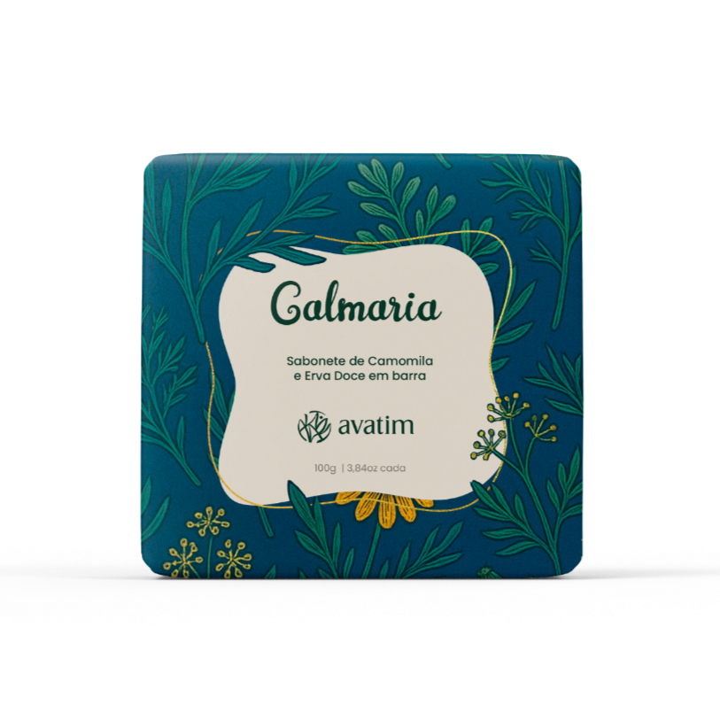


My Role — Art Direction & Visual Design
I led Art Direction, Packaging Design and Illustration for Encantaria. I defined the visual concept, color palette and graphic language, then created the key packaging layout and all product variants. I illustrated the botanicals and mystical elements, refined the logo lockup and organized information hierarchy so the line is easy to navigate in store and online. The result is a cohesive packaging system that tells a story, highlights ingredients and elevates the brand on the shelf.